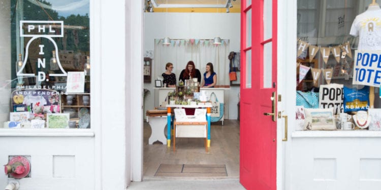
Going to a physical store is some sort of experience for each customer. If they are not satisfied after leaving your store, then there are small chances they will come back again.
Many retailers usually focus on the quality of the product. Of course, this is one of the key reasons why people want to do business with you again. Still, the path from checking the products to buying a product is huge. Logically, your customer service needs to be at a high-level. Still, the design of your store is equally important to people. They need to feel special in some way from the moment when they make the first steps in your store.
So, which store design is perfect?
The answer to that question does not exist. Many factors influence that including the size of your store, the products that you are offering to people, who your target audience is, etc. We are here to analyze those things. We will highlight a couple of tips that will help you perfectly design your store.
Pick the Right Floor Plan
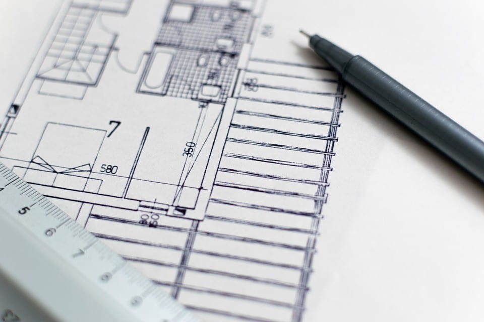
The floor plan is probably the biggest doubt of store owners. We have heard many times that owners start with one idea, but they end up with a completely different one. There a couple of questions that you need to ask yourself before designing your floor.
First of all, you need to know that you are not designing the store for yourself. It is important to determine which type of floor your customers would like to see. Besides that, you need to determine in which way they want to complete the purchasing. For instance, do they want to do it in a hurry or they have enough time to check everything? Are they bigger fans of self-service or they need something that will give them guides and directions?
We suggest that you analyze stores that are selling the same or similar things as you. Do not try to copy their floor plan. Their design only needs to serve as motivation. However, before you do that, it is necessary to know which types of floor plans exist.
-
Free Floor Plan
This type of layout allows users to be creative the most. You do not have any limits to shelves or floor patterns. It is a perfect design for those that do not need any guidelines. In this way, you will encourage them to research products in absolutely any direction.
-
Geometric Floor Plan
Well, this is a perfect choice if your goal is to make a unique store feel. Besides that, it might be a good option if you are selling trendy products. You can highlight them in this way.
-
Angular Floor Plan
Did you start to sell a new product and you want to somehow highlight it? Logically, the angular floor reduces the amount of display area. In that way, you can guide visitors to the more popular lines.
-
Loop Floor Plan
This is also a good layout if you plan to guide the visitors through your store. More precisely, you will encourage visitors to loop your store. This means that you need to position things in a way that they make some sort of connected path.
-
Straight Floor Plan
This type of design you will mostly see in larger stores and supermarkets. All racks or shelves are designed to be in a straight line. If you are planning to focus your layout on using shelves, then this would be a perfect choice.
All these types of design will look great in different situations. Still, it is also important that you fulfill your store with high-quality equipment. We suggest you check storefixturesdirect.com and see which types of hooks, shelves, and other accessories you can find.
Clockwise vs. Counter-Clockwise
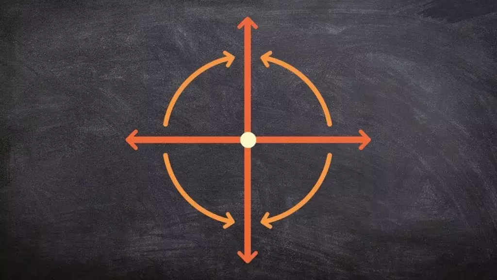
Well, there were huge debates about this subject and you will be able to hear many different opinions. One of the opinions is that most of the people are right-handed and they instinctively turn to the right to explore your store. This means that owners would rather choose to organize their products counter-clockwise.
However, there is another suggestion that is more focused on the location where you work. For example, people in Australia and the UK drive on the left side. Some experts say that people from these two countries tend to research stores in a clockwise manner. In the other parts of the world, things are completely different because of their driving behavior.
Don’t Place Too Many Products
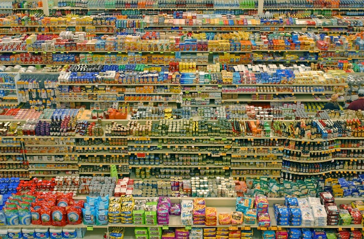
We have noticed that some stores put too many models of the items they sell. They probably do that because they think it will bring them a huger number of sales. Still, is that really the truth?
A huge number of items can make your store look messy. The customers get confused and they are not able to focus on a specific product. It is enough to put one or two models of each item that you sell. Most of the people will ask you if they need a different size, design, or features of the same product. That’s why it is necessary to have good customer service.
Ensure Enough Space between Features and Products
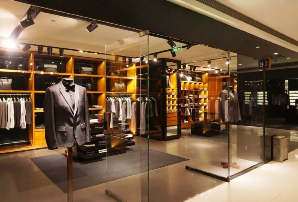
Have you ever heard about the butt-brush effect? It is some sort of phenomenon where shoppers would leave a product if they were bumped once or twice from behind while checking the product. This especially counts when we talk about female customers.
You must ensure enough space. As we said, going to a store is some sort of experience for each customer. You need to be sure that they shop under proper conditions.
Don’t Be Monotonous
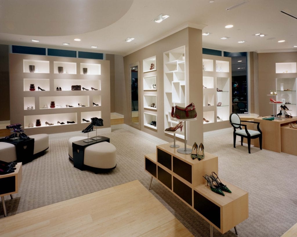
Each store owner should strive to fresh up the displays actively. We are not talking here about the renovation. Most of the highly professional stores will renovate their store once a year. However, we are talking here about changing the position of the items that you sell. For instance, we suggest you do not change the entire store. However, changing some parts would be perfect. Let’s say that changing the outfits of your mannequins and things like that you should do once a week.
So, what’s your idea? How would you like to design your store? We would like to hear you!

